P&L Analysis Graph

Contents
Once the data source is selected and the trades that you want to analyze are entered, the total Profit & Loss Analysis Graph appears.
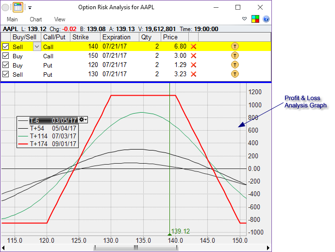
The graph plots projected P&L on the trade setup that includes all the selected trades for different values of the underlying security.
Depending on the Chart tab's Step By setting, different lines represent either various dates (usually in the future) or different additional volatility levels at one particular date in the future.
Scrolling and Zooming the Graph |
The graph can be scrolled right/left using several methods
•Place the mouse cursor on the graph and use the wheel
•Hold the
•Grab the scroll bar at the bottom and move it
•Use the shortcut keys (by default
•Use the Re-center ( |
The graph can be zoomed in/out using several methods
•Place the mouse cursor on the graph and use the wheel while holding the
•Grab one of the sides of the scroll bar at the bottom and move it
•Use the shortcut keys (by default
•Use the Zoom In and Zoom Out buttons in the View tab of the ribbon menu. |
Customizing the Graph |
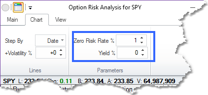
There are some parameters that can be set in the Chart tab of the ribbon menu that affect the graph in the Parameters section.
Zero Risk Rate - is the current theoretical rate of return on an investment that has no risk whatsoever. People usually use current long-term yields on U.S. treasuries as the value here.
Yield - is current annual dividend yield on the underlying security.
Graph Parameters |
As mentioned above, the lines on the graph represent either various dates (usually in the future) or different additional volatility levels at one particular date in the future.
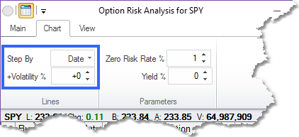
That is controlled by the settings in the Chart tab of the ribbon menu in the Lines section. If Date is selected for the Step By option, then you can also specify additional volatility (or +Volatility %) for the graph.
If +Volatility is selected for the Step By option, then you would have to specify the date for which the lines are drawn.
Line Parameters |
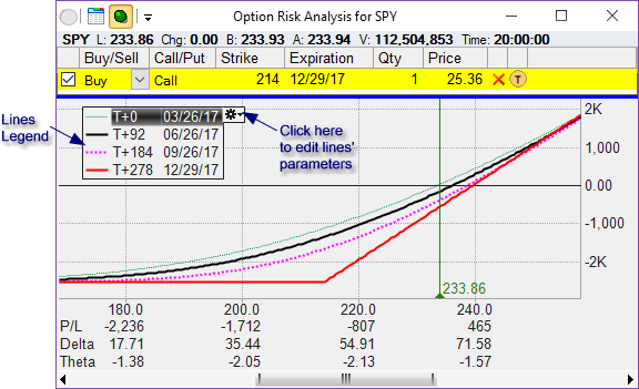
As mentioned above, the lines on the graph represent either various dates (usually in the future) or different additional volatility levels at one particular date in the future. You can have up to 10 lines representing 10 different dates (or, if +Volatility is selected in the Step By option, 10 different volatility levels).
In order to change the number of lines as well as their values or drawing styles, click on the gear icon ![]() on the legend box. That will open the line editor window:
on the legend box. That will open the line editor window:
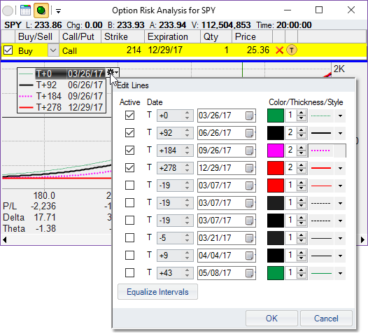
Note that you can have up to 10 lines. Make as many lines active as you want. The Equalize Intervals button will find the highest and lowest active line value and set the other active lines to be equally spread between the two.
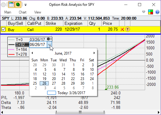
You can also double-click on the line in the legend box to edit its value or its thickness/color/style (depending on which part of the line description you double-click on).