Charts - Axes

Contents
Horizontal Axis |
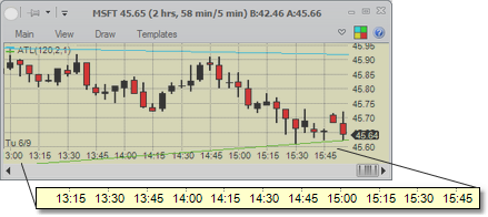
For intraday time-based charts (see Chart types), the horizontal axis shows a smooth progression of time (separated by session). Each candle covers a set period of time (for example, 5 minutes in the chart above), so the time distance between adjacent candles is the same. The chart ticks attempt to show the smallest periods of time that can be placed so that the tick labels do not overlap each other. Thus, if you see that a candle is shown at 14:15, and the chart's frequency is 5 min, you know that the next candle is at 14:20 even if it has no tick on it showing that time.
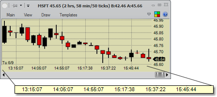
For intraday non-time-based charts, such as the tick chart above, the horizontal axis' time progression is not smooth, but shows the time stamps of candles at certain intervals (again, making it the smallest interval allowed so that the labels do not overlap). To find what the timestamp is for a candle that does not have a tick showing for it, you have to use tracing or zoom in.
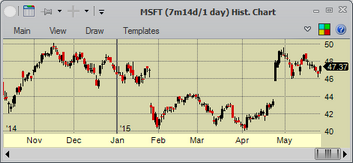
For historical charts, the horizontal axis' ticks show the date of the candles. For OHLC, Candle and Line charts, the axis' time progression is fairly smooth (allowing for skipping weekends and holidays if appropriate), but may show only months or years if the resolution doesn't allow for showing dates. For Renko and Point&Figure charts, just like with intraday non-time-based charts, the ticks on the axis show only dates of candles at certain intervals.
Horizontal Axis - Padding On the Right |
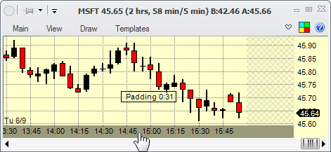
Sometimes, you may want to add extra space on the right of the chart (for example, so that you could extend trendline annotations into it). You can do it by clicking on the horizontal axis and dragging right to add padding or left to remove padding from the axis. The padded space will appear cross-hatched. You can do this on both intraday and historical charts.
Vertical Axis |
In all other examples in this help file, the vertical axis in the charts appears on the right of the chart. You can change it to be on the left in Settings - Charts - General. That will change it in all the charts.
The vertical axis shows the price of the security the chart is tracking. By default, the range of the vertical axis is dynamically changed to accommodate the visible part of the chart (and the indicators if Adjust Scale option is selected for the indicator). That behavior can be changed by setting a different option for the axis:
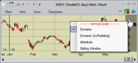
You do that by right-clicking on the vertical axis and selecting the axis type you'd like
•Dynamic - the axis' scale will adjust to accommodate the visible chart's prices and indicators, if needed
•Dynamic (with Padding) - same as the Dynamic, but will pad the scale top and bottom the specified amount
•Absolute - the scale will always stay the same - you specify the top and bottom
•Sliding Window - you specify the size of the scale, and the scale will adjust so that the rightmost visible candle's price is always in the middle of the scale |
Second way to adjust the scale is to click and drag on the vertical axis. That will adjust the parameters of the currently selected axis type visually.
Third way to adjust the scale is to use ![]() - mouse wheel while the mouse cursor is on the chart. This will adjust the parameters of the currently selected axis type visually. For example, for the absolute scale type it will increase or decrease the absolute range of the scale, making sure that the data at mouse cursor stays in same place.
- mouse wheel while the mouse cursor is on the chart. This will adjust the parameters of the currently selected axis type visually. For example, for the absolute scale type it will increase or decrease the absolute range of the scale, making sure that the data at mouse cursor stays in same place.
Vertical Axis - Label Spacing |
By default, the labels on the vertical axis are spaced in a way that accommodates maximum granularity. You can change that by hovering the mouse over the Y axis and using the ![]() - mouse wheel to change the spacing (or, if you checked the appropriate selection in the Chart Settings, you could just use the mouse wheel over the Y axis).
- mouse wheel to change the spacing (or, if you checked the appropriate selection in the Chart Settings, you could just use the mouse wheel over the Y axis).